Posts tagged ‘day job’

March 28, 2014

Round One: Fast Times in Palestine [ 2013 ]

by seven miles

first, i was asked to design covers for this young journalist’s memoir that reflected the dreamy times spent getting to know a side of the people that went against what is splashed all over the news media. balmy nights spent in conversation on porches, sharing a hookah, rich culture, a lot of heart, unexpected romance:

cover designs by Domini Dragoone


then we decided to switch gears and bring in more of the frenetic energy of her experiences:

cover designs by Domini Dragoone

ultimately, the cover design was repositioned and we went with a much more subdued design,  but i enjoyed exploring these designs in the early rounds! more of my work can be found at: www.dominidragoone.com

January 6, 2013

Round One: Railtracks [ late 2012 ]

by seven miles

this is a design project i did last year for Counterpoint Press, one of my favorite publishers to work for. the texts they ask me to make covers for happen to sync so nicely with my interests, and are also simply great books. this one was a new printing of a work produced by two playwrights, originally performed as a theatrical piece, and then later the words were paired with a set of dreamy abstract images for a printed iteration.

Counterpoint asked me to think of a creative package that might serve the (relatively) short text and conceptual/dream-like quality of the word and photos as a unit—without resorting to expensive special processes. a challenge! i was given a batch of the photos from the book, and asked to use those in my designs. i knew the book would be produced as a hardcover, so i experimented with the pieces that make up that form: boards, papers & spine cloth that cover the boards, and paper jackets.

option no.1:

Image

this first idea used a glossy permabind book that simply had one of the lovely images printed full bleed over the whole case. the gray vertical band is meant to be a belly-band of matte white stock printed with one color (a screen of black). i thought the contrasting textures, and saturated colors vs. dusty gray ink would make a nice, tactile package.

option no.2:

Image

this option also takes advantage of a contrast of texture & color, but in a different way: my idea was to have the book boards remain uncovered, and only wrap the spine in a glossy binding printed with a slice of one of the photos. at left, the cover text prints as a spot gloss on the rough, dry boards. if we could afford one more process, i recommended a de-boss, hit with the spot gloss. (i hoped that nixing the cost of the paper to cover the boards might allow for this.) subtle, but not something i’d be able to pass in a bookstore without picking up to touch…

option no.3:

Image

one thing i heard in my mind the whole time i worked on this project (in addition to the ephemeral voices of the narrators, speaking their memories) was the sound a train makes as it travels over tracks. clack clack… clack clack…. rummmmmbleclack clack … clack clack… as i ride a train to work each day, it’s sound i know well. this cover is a visual interpretation of that rhythmic and percussive sound, which is staccato yet at the same time, also very fluid and rolling. i considered printing screens of white and the white text on vellum, and wrapping a printed permabound package, but decided the dark-light contrast of a 4-color permabound case served the design better.

option no.4:

Image

this option does suggest printed vellum over a printed case . . . which maybe kinda threw out the whole “no expensive bells and whistles” directive, but i felt like it was worth it to include it, for variety, if nothing else: the look is a bit younger, if the publisher decided they might want to skew the marketing towards a more edgy/artsy market. (which the book manages to be, even while being about train trips and stations, old memories, long-lasting associations . . . it’s such a great book. i love it : )  )

option no.5:

Image

for the last two options (this and the next) i presented two designs that were just permabound books, no belly-bands or any other unique processes. this design is another take on the clackety noise of the wheels over tracks, this time pulling the type into the representation. i’m fond of it, i think it does the job quite nicely.

option no.6:

Image

second plain permabound option. for this design, i thought of the simplicity of the text—it’s very poignant, but felt like clear water—so, single images, no shenanigans. one snapshot from the collection of memories. i let the type and the lines suggest the more foggy, layered quality and the sense of motion of the memories presented within.

i loved working on this book; can’t wait to get my copy of the finished book. 🙂

Counterpoint Press, February 2013, on Amazon.

to see more of my book cover and interior page designs, please visit my online portfolio.

May 15, 2012

tiny studio.

by seven miles

domini dragoone book cover design photography photo shoot still life

an idea for a book cover design needed a custom photo. tiny studio, activate!

May 1, 2012

this is not a photo booth. [ Feb 2012 ]

by seven miles

April 30, 2012

my girlfriend charlotte. [2008]

by seven miles

i spent an enormous amount of time throwing everything in my apartment onto my scanner and building the 250-odd pages of this book. the book itself never seems to have found it’s audience, but i had such a blast being able to make use of the myriad sketches, silk screens, half-finished paintings, blurry photos, and antique ephemera i have in my vast stockpiles! no one but me could have produced the pages in that book, and it gave me a lot of satisfaction to see how much work i’ve produced over the years…. and that even if i hadn’t finished something, i could still take what was best of it and stitch it to the rest. conversely, giving new life to old completed pieces felt good as well. i enjoy looking at the pages now that i am far enough away from the project and remembering what random things make up all of the layers (ie, a black lace dress became, once reversed to white, fog that lays over a line drawing of the golden gate bridge!).

the title of this post refers to how much time i spent on this project- friends would ask after my plans for the evening, and i would say, “oh, i’m spending time with my girlfiriend Charlotte” (a reference to a character referenced in the book title). following are some selected backgrounds and details of backgrounds that i like best.


January 17, 2012

Too Much to Dream / Peter Bebergal [mid 2011]

by seven miles

domini, dragoone, book, cover, design, exploration

my favorite versions of a cover i designed for Soft Skull Press mid-last year. sometimes the steering wheel gets taken from a designer en route to the final destination, but i was happy with these explorations! interesting books make for a stimulating project.

to see a portfolio of my book cover design work, please me at: www.dominidragoone.com

September 12, 2010

[ Round 1 ] Pagan Time / Micah Perks

by seven miles

Pagan Time: An American Childhood, by Micah Perks
Counterpoint Press, 2009

Pagan Time on Amazon, click here

August 29, 2010

inside, out.

by seven miles

(click photo once, then click again to see larger detail)

August 22, 2010

[Round 1] The Paradise Bird Tattoo . . . / Choukitsu Kurumatani

by seven miles

i’ve been pouring over a manuscript for a new cover project, and it pleases me to say that i find it as engrossing and thought provoking as i did the manuscript for this book when i first read it. there is a magical quality to having an unpublished manuscript in my hot little hands, and knowing that the images i see behind my eyes while reading it are what will end up as the face it shows the world upon venturing out. certain books make me feel honored to be trusted with such a duty, and similarly wonderful is that this pleasurable process of getting to know characters and stories and the mechanisms that propel them is what i get to call “work”.

i can’t wait to sit down with Paradise Bird when it is finally published and read it again, this time slowly and leisurely. the events and themes are gritty, deep, and powerful, yet are presented to the reader in such spare and unselfconscious writing; working on the cover for this book reminded me of what it is about my work that i love most: the pleasurable challenge.

“from this point on, i began to sleep under even colder covers—there was a certain perverse comfort in doing so, but there was nothing more to the comfort than that it existed.”

“we collapsed together like a wall of melting ice.”

“chanced to see”

The Paradise Bird Tattoo (or, Attempted Double-Suicide) on Amazon

——

p.s. two other books with have similar qualities that i enjoyed reading very much:
Lessons in Essence
by Dana Standridge


The Old Capital by Yasunari Kawabata

July 31, 2010

[ Round 1 ] Girl in Need of a Tourniquet / Merri Lisa Johnson

by seven miles

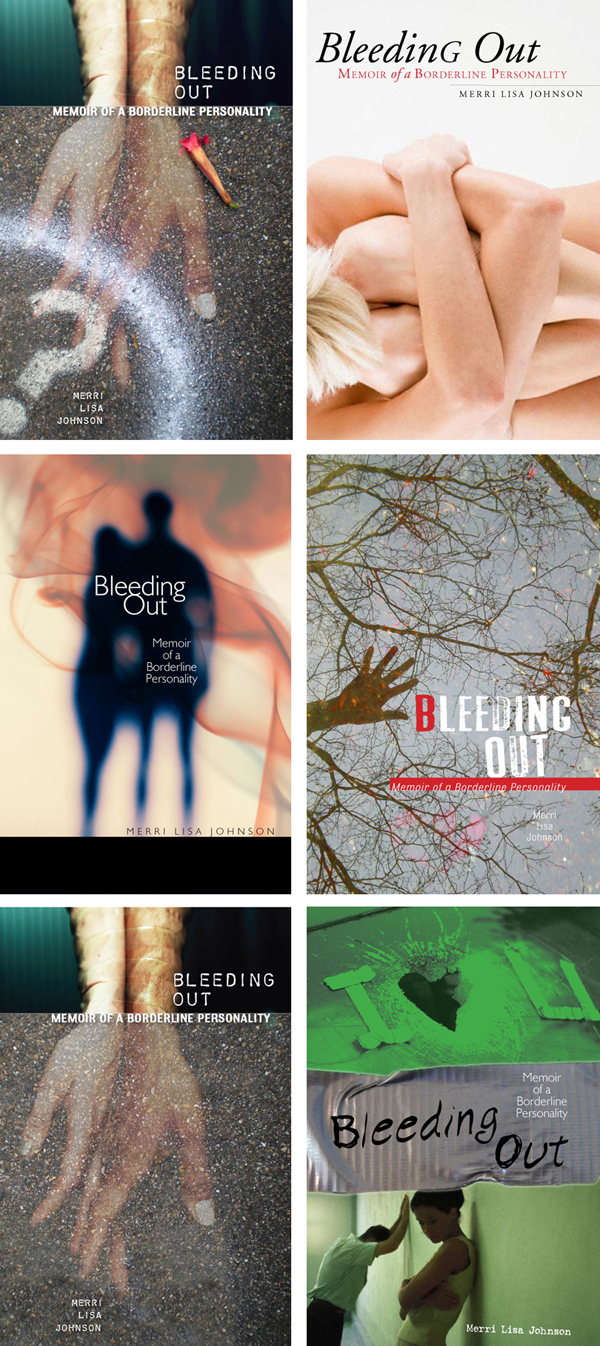
when this cover first came to me, the book was set to be titled “Bleeding Out”

upon sending a galley to singer Aimee Mann for review and securing her permission, the book was named after a lyric from one of her songs that author Merri Lisa Johnson identified with:

i designed and laid out the interior as well as the cover, so i am intimate with the text of this story— this book is vulnerable, intuitive, tenacious, and illuminating. sometimes it is difficult; sometimes it is frustrating. but all of these qualities are what make it so real, and intimate.

it involved me emotionally to work on this book. like method acting, book cover designers attempt to get inside a tome and ask it what it wants a prospective owner to know, at a glance. how would it introduce itself? what first impression would it like to make? (or at least, that’s a large part of how i work.) when laying out interior pages, i aspire to find a visual representation that allows the words to speak in their native inflections and cadence. this project was difficult; it made my skin itch. it scattered my mind. and i must say, i think that’s what makes it a success—Lisa (as she prefers to be called) dumps the skeletons in her closet, and all of the bats in her belfry, onto the pages and examines them unflinchingly. i respect the piece that she made, and i hope that the visual language i gave it helps the story connect with each one of it’s readers. thanks to the author for so candidly sharing her her experience.

Girl in Need of a Tourniquet on Amazon, click me.